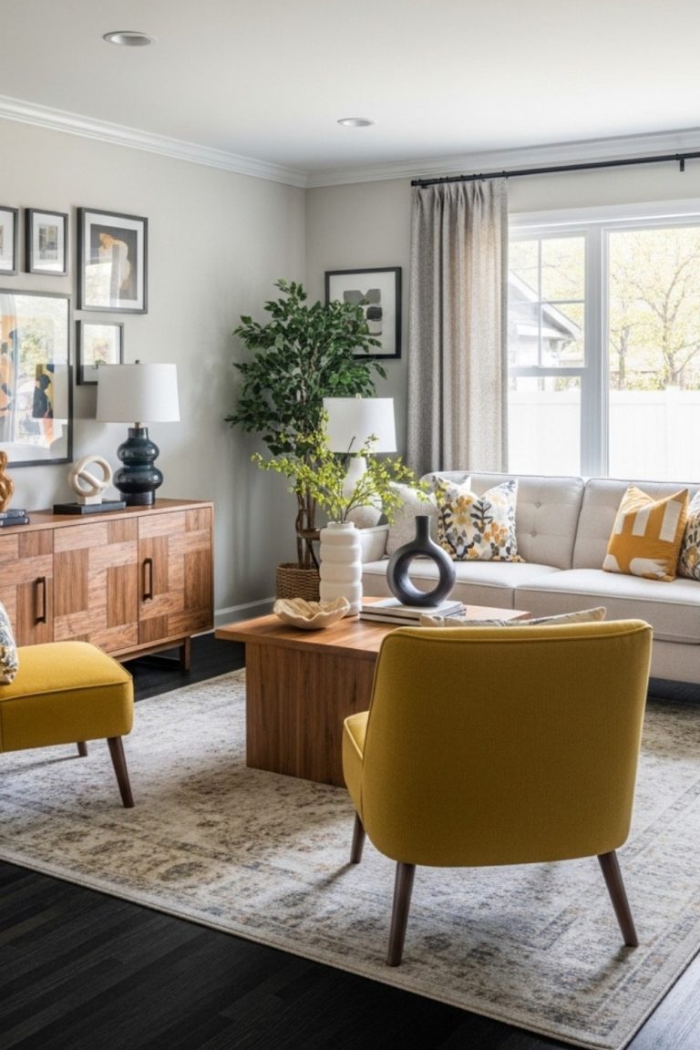
What Wall Color Goes With Cherry Wood Floors? Expert Guide
Cherry wood floors are naturally rich, warm, and full of character. But the wrong wall color can make them feel outdated, overly red, or visually unbalanced. The key is to understand the wood’s undertones and choose colors that complement them rather than compete.
In this guide, I will show you 8 designer-approved wall color pairings that work beautifully with cherry wood. Each option is explained with simple color theory, practical room examples, and clear guidance you can trust. You will also find a helpful list of colors to avoid so you do not make costly mistakes.
Whether you are updating a living room, bedroom, or kitchen, this guide will help you choose the right color with confidence from the start.
Understanding Cherry Wood: The Undertones That Shape Every Color Choice
Before you pick a paint color, it helps to understand what you are working with. Cherry wood has a naturally warm, reddish-brown undertone that becomes deeper over time. New cherries often look more honey-brown, while older or antique cherry shift toward a richer burgundy tone.
This warm red base is the detail that influences every wall color decision in the room. If you ignore it, even a beautiful paint color can feel slightly off or unbalanced.
Interior designers treat wood floors much like they approach fabric or finish pairings. The undertone of the floor should either blend smoothly with the wall color or create a clear, intentional contrast. Anything in between usually feels dull or mismatched rather than polished.
Light vs. Dark Cherry: Why It Matters
Not all cherry floors behave the same, and the difference is important.
Lighter cherry, often found in newer floors, has more brightness and flexibility. It can work with a wider range of shades, including some softer, muted cool tones when balanced carefully.
Darker cherry, which develops with age, is more dominant and requires thoughtful pairing. It tends to look best with warm wall colors or neutrals that have a subtle warm base. Without that balance, the space can start to feel too dark or enclosed.
If you are unsure where your floors fall, start by identifying whether they lean light or deep in tone. That simple step will make every color decision easier and more accurate.
8 Best Wall Colors That Pair Beautifully with Cherry Wood Floors
1. Warm White
Benjamin Moore White Dove (OC-17)
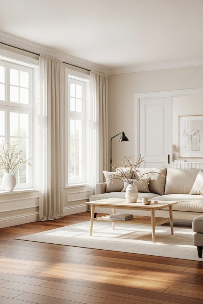
Warm white is one of the most reliable choices for cherry wood floors. Benjamin Moore White Dove stands out because it has a soft, creamy base instead of a stark, cold finish.
This subtle warmth blends naturally with cherry’s undertones, avoiding the harsh contrast that can make floors look overly red or orange. The result feels bright, clean, and balanced.
It is especially effective in open spaces where you want light without losing warmth. Using the same shade on trim keeps everything cohesive and calm.
Best for: living rooms, hallways, open-plan areas
2. Soft Sage Green
Sherwin-Williams Softened Green (SW 6177)
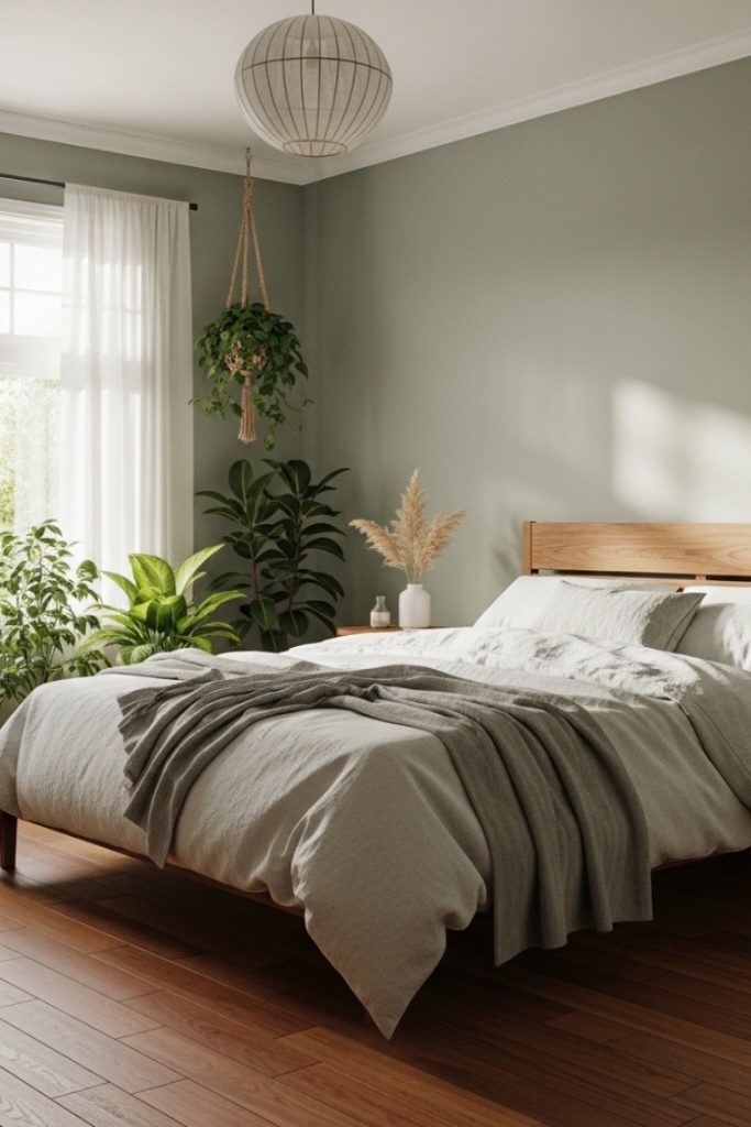
Sage green works because of simple color theory. Green sits opposite red on the color wheel, which makes it a natural complement to cherry wood.
Sherwin-Williams Softened Green includes a soft gray base, which keeps it from feeling too earthy or overpowering. The combination feels grounded, fresh, and quietly sophisticated.
In bedrooms especially, this pairing creates a calm, nature-inspired atmosphere that feels relaxing without being dull.
Best for: bedrooms, sitting rooms, home offices
3. Creamy Beige or Greige
Behr Antique White
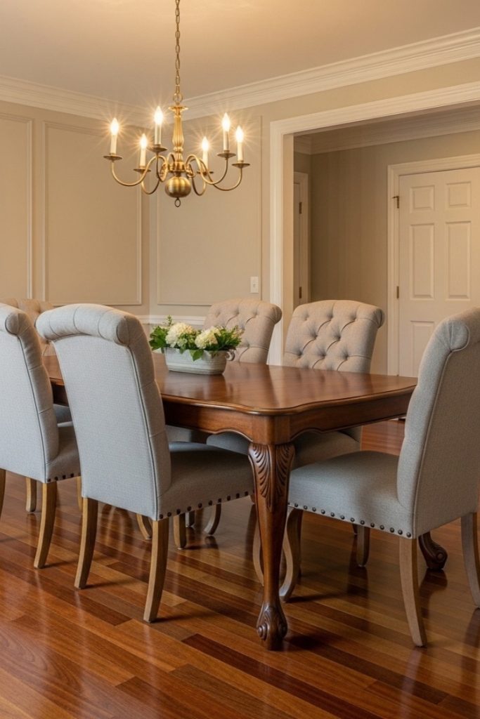
If you want something timeless and low-risk, this is it. Behr Antique White sits comfortably between beige and white.
It has enough warmth to support cherry wood, but enough neutrality to work with almost any furniture style. Instead of competing, the walls step back and let the flooring stand out.
This approach is common in traditional and transitional interiors where balance matters more than contrast.
Best for: dining rooms, traditional living rooms, bedrooms
4. Dusty Blue-Gray
Sherwin-Williams Misty (SW 6232)

Blue can work with cherry wood, but only when softened. Misty is a blue-gray with a slightly muted base, which prevents the clash you often see with brighter blues.
The gray undertone acts as a bridge between cool and warm, creating a modern feel without fighting the floor’s natural richness.
Avoid clear or icy blues. Those tend to push cherry wood toward an unwanted orange tone.
Best for: modern living rooms, transitional bedrooms
5. Terracotta or Rust
Benjamin Moore Moroccan Spice (2171-20)
If you want to embrace warmth fully, terracotta tones create a rich, layered look. Moroccan Spice sits in the same warm family as cherry wood, making it an analogous pairing.
Instead of contrast, you get depth. The room feels intimate, dramatic, and intentionally styled.
This works best in smaller spaces or feature walls where a cozy, enveloping mood is the goal.
Best for: dining rooms, accent walls, studies
6. Warm Taupe
Sherwin-Williams Accessible Beige (SW 7036)
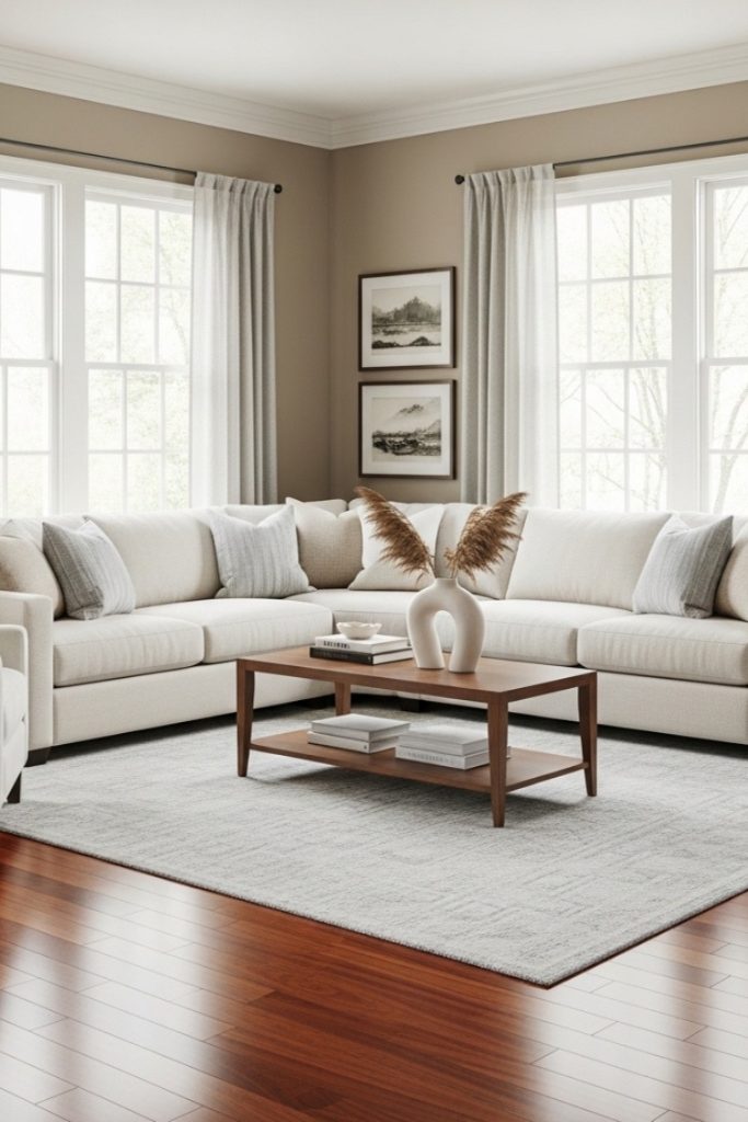
Accessible Beige is popular for a reason. It sits between beige and gray, offering the flexibility of a neutral with a soft, warm base.
Unlike cooler taupes, it does not compete with cherry’s red undertones. Instead, it quietly supports them while adapting to different furniture styles.
It is one of the safest choices if you want a polished look without overthinking the palette.
Best for: living rooms, dining rooms, multi-use spaces
7. Olive or Moss Green
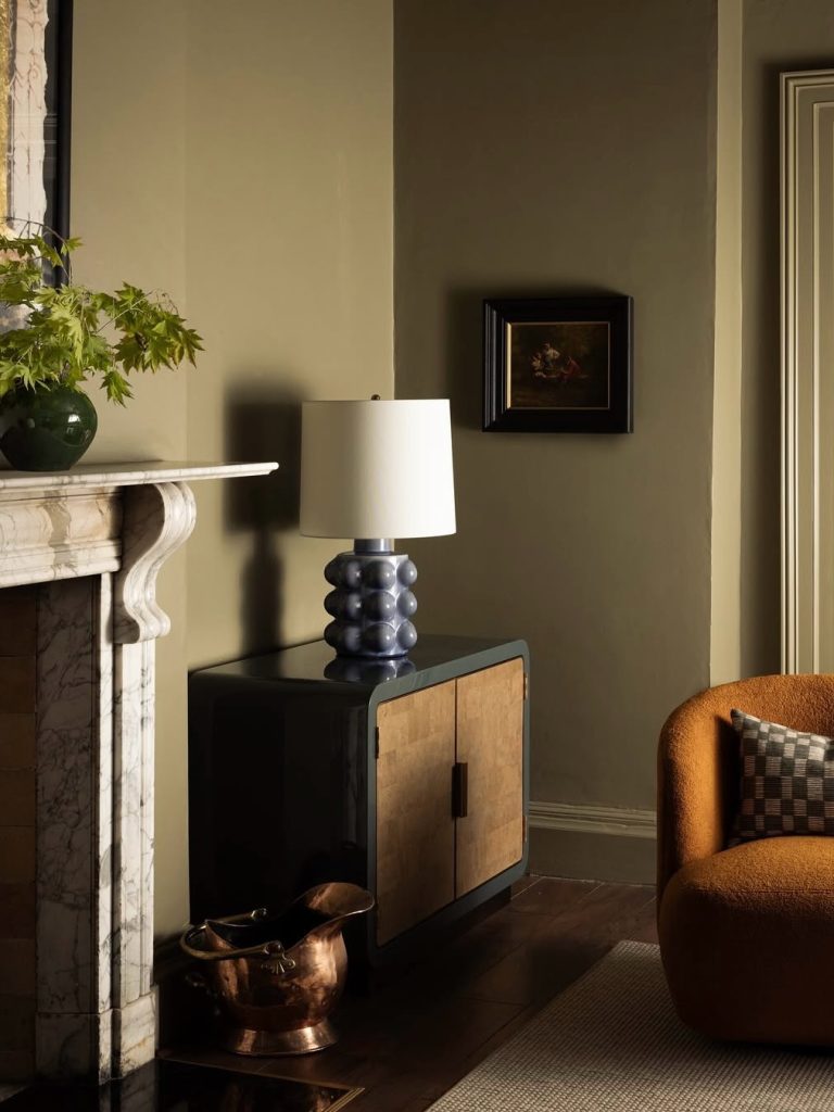
For a deeper, more dramatic look, olive and moss greens bring richness and sophistication. These tones have a yellow base, which naturally connects with cherry wood’s warmth.
The depth of the color balances darker floors especially well, creating a space that feels grounded and intentional.
This is a stronger design choice, best used where you want mood and character rather than lightness.
Best for: studies, libraries, well-lit living rooms
8. Soft Gold or Honey Yellow
Benjamin Moore Golden Straw (2152-50)
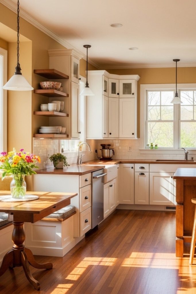
For a brighter, welcoming feel, soft gold tones are often overlooked but highly effective. Golden Straw has a warm, muted base that ties directly into cherry’s amber tones.
The result feels warm and cheerful without becoming overwhelming. In natural light, this pairing can make a room feel almost glowing.
It works especially well in spaces where energy and comfort should meet.
Best for: kitchens, breakfast nooks, sunrooms
Quick Comparison: Wall Colors With Cherry Wood at a Glance
| Wall Color | Paint Example | Room Mood | Best Room |
| Warm White | BM White Dove OC-17 | Bright, airy, timeless | Living room, hallway |
| Soft Sage Green, organic | SW Softened Green SW 6177 | Calm, Fresh | Bedroom, office |
| Creamy Beige | Behr Antique White | Warm, neutral, classic | Dining room, bedroom |
| Dusty Blue-Gray | SW Misty SW 6232 | Modern, airy, cool-neutral | Living room, bedroom |
| Terracotta /Rust | BM Moroccan Spice 2171-20 | Rich, dramatic, bold | Dining room, accent wall |
| Warm Taupe | SW Accessible Beige SW 7036 | Sophisticated, grounded | Living room, multi-use |
| Soft Gold | BM Golden Straw 2152-50 | warm, welcoming | Sunny, Kitchen, sunroom |
| Olive / Moss Green | Deep olive of choice | Moody lush, enveloping | Study, library |
Room Function
- Bedroom: Soft sage, creamy beige, or dusty blue-gray — calming, restful, conducive to sleep.
- Living room: Warm white, warm taupe, or accessible beige — versatile, welcoming, works with most furniture.
- Kitchen: Warm white or soft gold — bright, energetic, maximizes light.
- Dining room: Terracotta, warm taupe, or creamy beige — intimate, warm, enhances a sense of occasion.
Final Thoughts
Choosing the right wall color for cherry wood floors comes down to one foundational rule: respect the warmth. Lean into warm whites, earthy neutrals, sage greens, and analogous warm tones. Use cool tones only when they carry a warm gray base to bridge the gap. Avoid pure cool colors, bright whites, and competing reds.
Test two or three swatches on your actual walls before committing what looks right in a paint store or on a screen almost always looks different in your specific room’s light. Trust the process, trust the undertone, and your cherry wood floors will thank you.
FAQ
It depends on the grey. Cool, blue-based grays clash with cherry wood’s warm undertones and should be avoided. Warm grays with beige or taupe bases — often called “greige” — work beautifully. Sherwin-Williams Accessible Beige and similar warm-neutral grays are reliable choices.
Furniture in warm neutrals, creams, camel leather, or upholstered pieces in sage green, dusty blue-gray, or warm gold all complement cherry wood floors well. Avoid cold grays or stark white upholstered pieces, which can create the same clash as cool wall colors.
Across all hardwood types, warm whites and warm neutrals (greige) consistently top the charts. For cherry wood specifically, warm white — particularly Benjamin Moore White Dove — is the most widely recommended by designers and the most searched-for combination online.