What Color Furniture Goes With Dark Wood Floors?
Dark wood floors instantly make a home feel elegant, warm, and refined. They bring depth, character, and a timeless foundation that works beautifully in both modern and traditional interiors.
But there is a catch.
Dark flooring can also make a space feel smaller or heavier when the surrounding elements are not balanced carefully. The wrong furniture choices can turn a sophisticated room into one that feels closed-in or visually overwhelming.
That is why designers rely on one simple principle when working with dark wood floors:
Balance contrast with harmony.
Too much dark furniture can make the room feel dense and heavy.
Too many light pieces without warmth can make the space feel flat or disconnected.
The goal is to create a mix that feels intentional, layered, and visually comfortable.
In this guide , you will know :
- The most effective furniture colors for dark wood floors
- How to identify and match undertones correctly
- Common mistakes that can disrupt the entire look
Understand Your Dark Wood Floors First
Before choosing any furniture, take a few minutes to study your floors. Most design mistakes happen when colors are selected in isolation, without considering how they interact with the depth and tone of the flooring.
Dark wood floors are not just “dark.” They carry subtle undertones, react differently to light, and vary by wood type. Once you understand these three elements, every design decision becomes clearer.
Identify the Undertone: Warm vs. Cool
Dark wood comes in a range of undertones, and this is the single most important factor in choosing furniture colors.
Warm undertones include hints of red, orange, amber, or gold.
You will often see this in floors like mahogany, cherry, or warm walnut. These floors feel inviting, soft, and naturally cozy.
Cool undertones lean toward gray, ash, or near-black.
Ebony or dark gray-stained oak typically falls into this category. These floors feel sleek, modern, and more structured.
How to tell:
Look at your floor in natural daylight, ideally midday.
- If you notice red or golden tones, it is warm
- If it looks charcoal or slightly gray, it is cool
This one observation will guide every furniture and color choice that follows.
Why it matters:
Color temperature needs consistency. Warm floors paired with cool furniture often feel slightly off, even if you cannot immediately explain why. When tones align, the room feels calm and cohesive. When they clash unintentionally, the space feels unsettled.
Consider the Room’s Natural Light
Light changes how dark floors behave. The same floor can feel rich and glowing in one room and heavy in another.
North-facing rooms
These spaces receive cooler, softer light. Dark floors tend to absorb brightness, making the room feel dimmer. Lighter furniture becomes essential here. Shades like cream, white, or soft gray help reflect light and keep the space open.
South-facing rooms
These rooms are filled with warm, consistent sunlight. Dark floors look their best here, often appearing richer and more vibrant. You have more flexibility to use deeper furniture tones and bold accents without making the space feel heavy.
East- and west-facing rooms
Light shifts throughout the day. Morning or afternoon sun can dramatically change how colors appear. It is best to test furniture tones at different times before committing.
Floor Species Matters
Not all dark wood floors create the same effect. The type of wood influences both color and mood.
- Walnut feels rich, warm, and naturally elegant
- Mahogany carries a deeper, traditional red warmth
- Ebony creates a bold, dramatic, modern look
- Dark-stained oak is more neutral and adaptable
Understanding your floor type helps you design with intention instead of guesswork.
Read More: What Color Coffee Table Goes Best With a Grey Couch?
The Best Furniture Colors for Dark Wood Floors
Once you understand your floor’s undertone and lighting, choosing furniture becomes much easier. The goal is simple: create contrast where needed and harmony where it matters. These color families consistently work because they balance both.
Light Neutrals (The Safest, Most Reliable Choice)
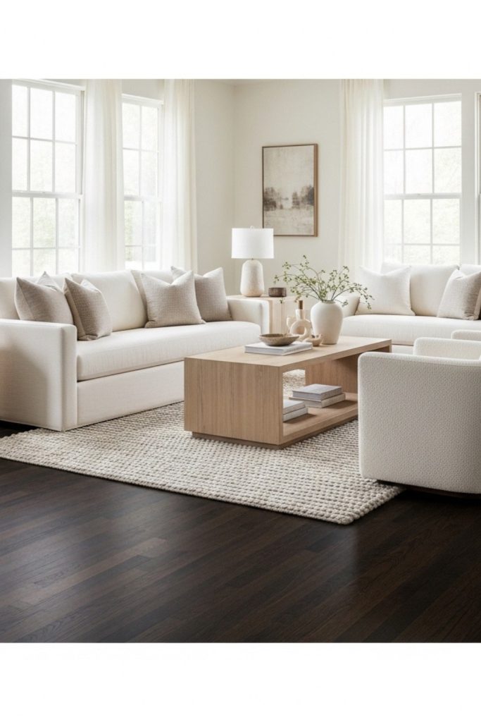
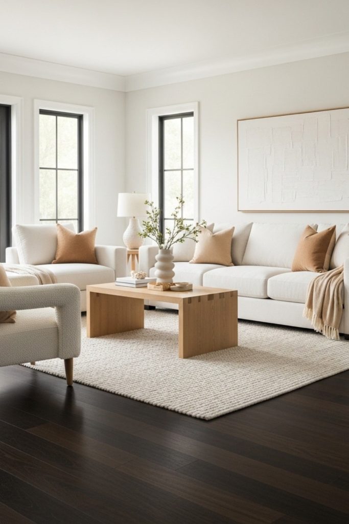
If you want a result that always feels right, start here.
White, cream, ivory, and soft off-white tones create clean contrast against dark floors. They lift the entire room, making it feel brighter and more open without much effort.
Instead of stark white, choose warmer variations like creamy white or bone. These feel softer and blend more naturally with the richness of dark wood.
This palette works especially well in:
- Living rooms
- Bedrooms
- Open-plan spaces
It is the easiest way to make a space feel larger, lighter, and more balanced.
Beige, Taupe, and Warm Neutrals

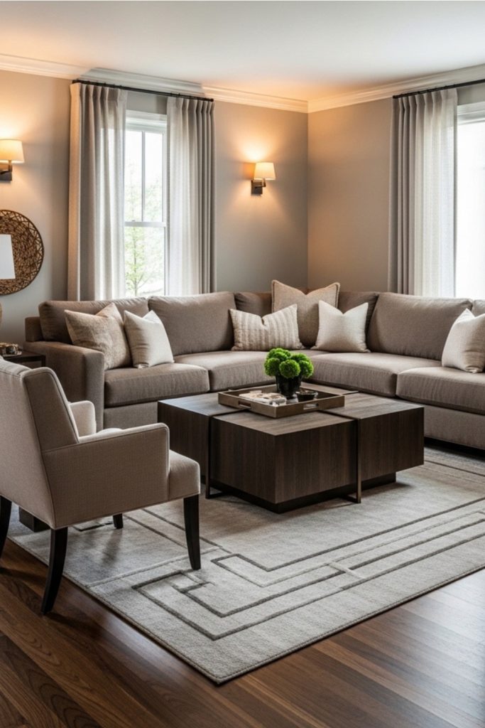
If white feels too sharp, warm neutrals offer a softer approach.
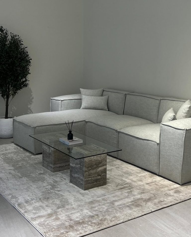
Beige, taupe, and sand tones create gentle contrast while keeping the space grounded and cozy. They pair beautifully with warm-toned floors and feel more relaxed overall.
To elevate the look, layer in:
- Brass or bronze lighting
- Warm wood accents
- Soft textiles like linen or wool
Best suited for:
- Family rooms
- Dining areas
- Comfortable, lived-in bedrooms
Gray Furniture (Light to Mid-Tone)

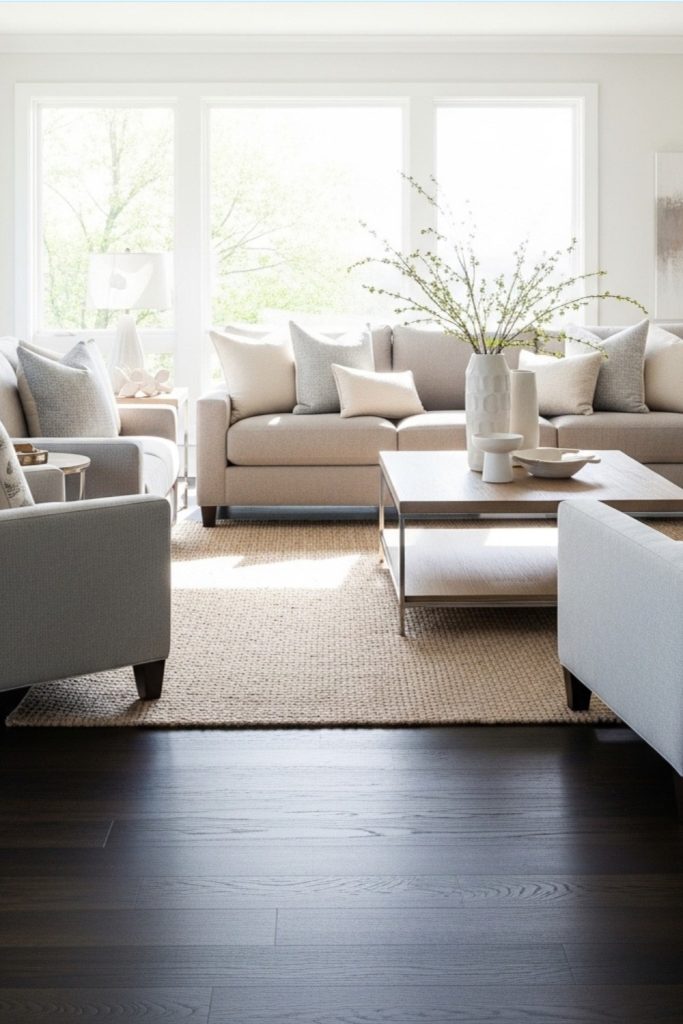
Gray adds a modern, refined feel, but choosing the right shade is important.
Light gray keeps the room fresh and open.
Greige (a mix of gray and beige) works especially well with warm floors, creating a smooth transition between tones.
Be cautious with very dark gray. It can blend too closely with the floor and make the space feel heavy.
Ideal for:
- Modern homes
- Minimalist interiors
- Scandinavian-style spaces
Bold and Jewel Tones (For a Statement Look)
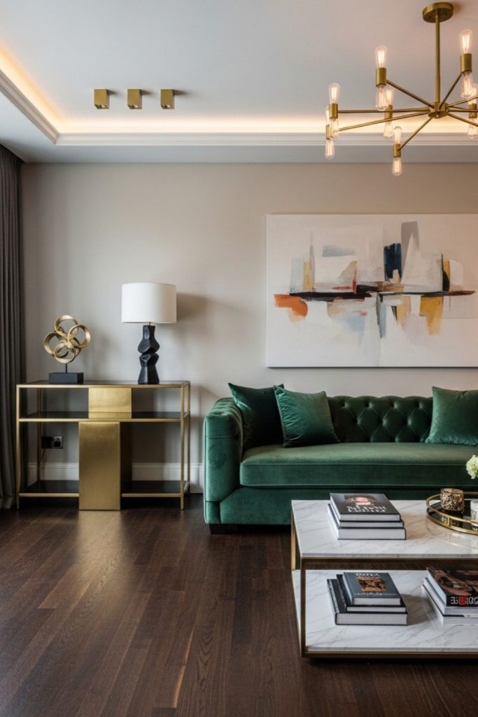
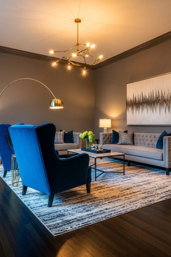
If you want more personality, rich colors create striking contrast.
Emerald green, deep blue, burgundy, and mustard tones stand out beautifully against dark wood. These shades turn furniture into focal points rather than background pieces.
Velvet upholstery enhances this effect by adding depth and a subtle sheen.
Use this approach in:
- Formal living rooms
- Dining spaces
- Accent seating areas
Yellow and Mustard Accents
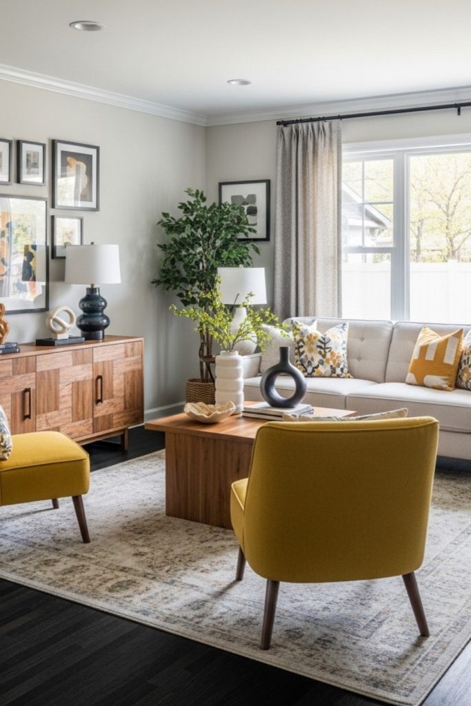
Yellow is often overlooked, but it works exceptionally well with dark floors.
Mustard and ochre tones add warmth and brightness without feeling too bold. They naturally balance the depth of the flooring.
If you prefer a subtle approach, introduce it through:
- Accent chairs
- Cushions
- Ottomans
It is an easy way to bring energy into the space without overwhelming it.
Dark Furniture on Dark Floors (The Tonal Approach)

Pairing dark furniture with dark floors can look incredibly sophisticated, but it requires intention.
To make it work:
- Use lighter walls to create separation
- Add metallic accents like gold or chrome
- Layer in strong, well-placed lighting
A smart technique is to keep furniture frames dark while using lighter upholstery for seating. This prevents everything from blending together.
This style works best in:
- Larger living rooms
- Formal dining areas
- Library-style or moody interiors
Common Mistakes to Avoid
Even the right colors can fail if the balance is off. These are the mistakes that most often disrupt an otherwise well-designed space:
- Matching furniture exactly to the floor
When everything is the same depth, the room loses definition and feels flat. - Using too many dark pieces without contrast
Dark on dark without relief makes the space feel heavy and closed-in. - Ignoring undertones
This is where most designs go wrong. Warm and cool tones that are not intentionally paired create subtle visual tension. - Overcrowding the room
Dark floors already add visual weight. Too much furniture makes the space feel smaller than it is. - Relying only on furniture without improving lighting
Good lighting is essential. Without it, even well-chosen pieces can feel dull. - Mixing too many colors
Too much variety creates noise instead of a curated, cohesive look.
Conclusion
There is no single “perfect” furniture color for dark wood floors—and that is what makes them so versatile.
The right choice always comes down to three things: your floor’s undertone, the natural light in the room, and the atmosphere you want to create.
If you are unsure where to begin, start with one light neutral anchor piece, such as a sofa or bed. This creates immediate balance. From there, layer in color, texture, and contrast in a controlled way.
FAQ
Cream, white, light gray, beige, or jewel-toned sofas (emerald, sapphire) are top choices. Avoid very dark sofas unless the room has high ceilings and abundant natural light.
White, off-white, soft gray, sage green, and pale blue are designer favorites. Avoid overly dark walls unless the room is spacious and well-lit.
Soft neutrals, cream, warm beige, and patterned Moroccan or kilim rugs work best. A rug that contrasts slightly with the floor helps define zones and add visual warmth.